Using Lets-Plot to create Scatter Matrix#
This is an advanced example demonstrating the technique that can be used to plot Scatter Matrix using ggbunch() function of Lets-Plot library.
import numpy as np
import pandas as pd
from itertools import *
from sklearn.datasets import load_iris

iris_bunch = load_iris()

X, y = pd.DataFrame(iris_bunch.data, columns=iris_bunch.feature_names), iris_bunch.target
from sklearn.model_selection import train_test_split

X_train_val, X_test, y_train_val, y_test = train_test_split(X, y, test_size=0.2, random_state=42)
X_train, X_val, y_train, y_val = train_test_split(X_train_val, y_train_val, test_size=0.1, random_state=42)

X = X_train
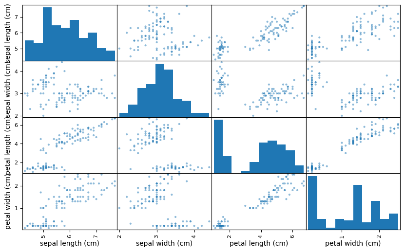
What is a scatter matrix?#
from pandas.plotting import scatter_matrix

scatter_matrix(X, figsize=(10,6));
features = X.columns.values
Lets-Plot#
from lets_plot import *
LetsPlot.setup_html()
Scatter plot#
ggplot(data=X) + geom_point(aes(x=features[0], y=features[1])) + ggsize(200, 200)
Histogram#
ggplot(data=X) + geom_histogram(aes(x=features[0])) + ggsize(200, 200)
Histogram for empirical density#
ggplot(data=X) + geom_histogram(aes(features[0], y='..density..')) + ggsize(200, 200)
Histogram with density plot#
ggplot(data=X) \
        + geom_histogram(aes(features[0], y='..density..'), alpha=0.7) \
        + geom_density(aes(features[0]), color='red', linetype='dashed', size=1) \
        + ggsize(200, 200)
We want y labels only for the left-most blocks and x labels only for the bottom-most blocks.
def scatter_plot(data, feat1, feat2, x_lab= True, y_lab = True, width=200, height=200):
    p = ggplot(data) + geom_point(aes(feat1, feat2), color=0x1F77B4) + ggsize(width, height)
    if not x_lab:
        p += labs(x='')
    if not y_lab:
        p += labs(y='')

    p += theme_void()
    return p
def hist(data, feat, x_lab= True, y_lab = True, width=200, height=200):
    p = ggplot(data) + geom_histogram(aes(feat, '..density..'), alpha=0.7, fill=0x1F77B4) + ggsize(width, height) \
        + geom_density(aes(feat), color='red', linetype='dashed', size=1)
    if not x_lab:
        p += labs(x='')
    if not y_lab:
        p += labs(y='')
    else:
        p += labs(y=feat)

    p += theme_void()
    return p
Make a scatter matrix using ggbunch()#
features = X.columns.values
n_feat = len(features)

x0, y0 = 0, 0
row, col = 0, 0
width, height = 160, 160
step = width + 5
x_lab, y_lab = True, True
total_width, total_height = step * n_feat, step * n_feat

plots = []
regions = []
for i in range(n_feat**2):
    if col == n_feat:
        col = 0
        row += 1
    x_lab = (row == n_feat - 1)
    y_lab = (col == 0)
    if col == row:
        plot = hist(X, features[row], x_lab, y_lab, width, height)
    else:
        plot = scatter_plot(X, features[col], features[row], x_lab, y_lab, width, height)
    plots.append(plot)
    regions.append((
        (x0 + col*step) / total_width,
        (y0 + row*step) / total_height,
        width / total_width,
        height / total_height
    ))
    col += 1

ggbunch(plots=plots, regions=regions) + ggsize(total_width, total_height)